Introduction: Unveiling the Curves
Welcome to this exploration of the Engel and Lorenz curves. While both are graphical representations used in economics, they serve distinct purposes. The Engel curve focuses on consumer behavior, while the Lorenz curve delves into income distribution. Let’s dive deeper into each curve’s characteristics and significance.
Engel Curve: Decoding Consumer Behavior
The Engel curve, named after the German statistician Ernst Engel, showcases the relationship between a consumer’s income and their expenditure on a specific good or service. It essentially maps out how consumer spending changes as income levels vary. By plotting income on the x-axis and expenditure on the y-axis, we can observe the curve’s shape. A few key insights the Engel curve provides include: 1. Income Elasticity: The slope of the curve indicates the income elasticity of demand for the good. Steeper slopes imply higher income elasticity, suggesting the good is a luxury item. 2. Inferior vs. Normal Goods: The curve’s shape can help distinguish between inferior and normal goods. For normal goods, the curve is upward-sloping, indicating that as income rises, so does expenditure. In contrast, for inferior goods, the curve is downward-sloping, implying that as income increases, expenditure on the good decreases. 3. Consumption Patterns: The Engel curve also sheds light on consumption patterns. For instance, a flat curve suggests a necessity, as expenditure remains relatively constant across income levels. On the other hand, a steep curve indicates a discretionary or luxury item, with expenditure rising significantly with income.
Lorenz Curve: Unveiling Income Distribution
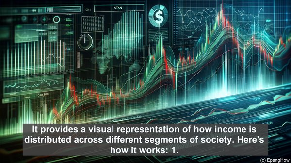
The Lorenz curve, developed by the American economist Max O. Lorenz, is a tool used to analyze income distribution within a population. It provides a visual representation of how income is distributed across different segments of society. Here’s how it works: 1. Cumulative Income: The x-axis of the Lorenz curve represents the cumulative percentage of the population, arranged in ascending order of income. The y-axis represents the cumulative percentage of total income held by that portion of the population. 2. Perfect Equality: In a scenario of perfect income equality, the Lorenz curve would coincide with the diagonal line, known as the line of perfect equality. 3. Gini Coefficient: The Lorenz curve’s deviation from the line of perfect equality is measured by the Gini coefficient. This coefficient, ranging from 0 to 1, quantifies income inequality. A Gini coefficient of 0 represents perfect equality, while 1 signifies maximum inequality. 4. Interpreting the Curve: The further the Lorenz curve is from the line of perfect equality, the greater the income inequality. The shape of the curve also provides insights. For instance, a concave curve indicates relatively lower inequality, while a convex curve suggests higher inequality.